Omni Cook
2019 | Product Design | New York | Duration: 2 weeksProject introduction
“Omni Cook” is a recipe and lifestyle blog that offers subscription service for young adults to better plan their groceries shopping and potentially help with their time management.
This is a self-initiated project competed as part of my self-teaching journey as a product designer. The goal of this project is to take an idea I have and adapted it to a visual prototype. I gave myself two weeks to complete this fast-paced challenge. It was fun!
Role
UX/UI Design, Branding, Illustration, Research
project goal
Design a landing page that makes Omni Cook stand out from competitors.
Cohesive graphic elements throughout the website and web app.
Build a brand speaks to young audience.
Tools
Sketch, Figma, InVision Studio, Illustrator
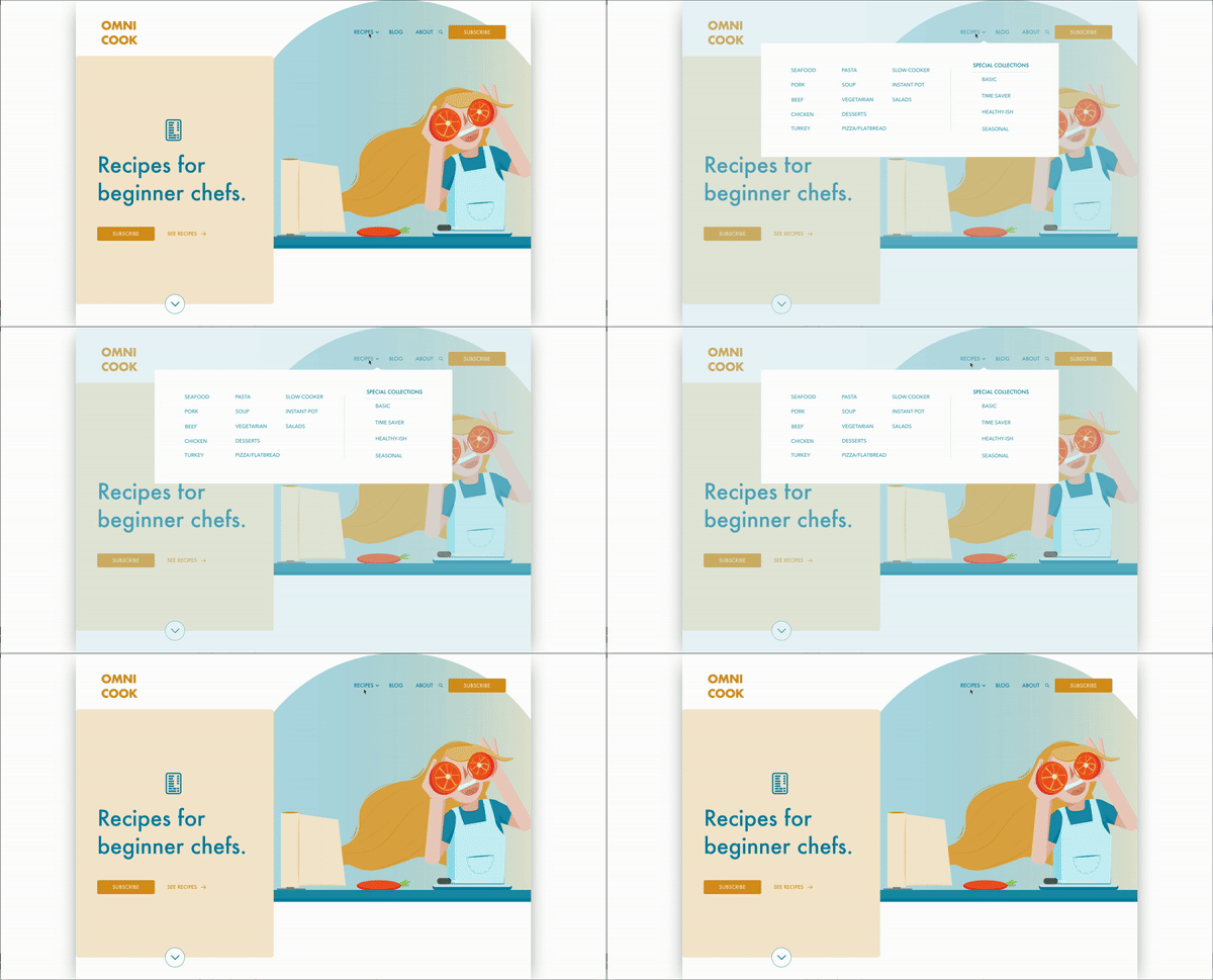
Final Deliverables | Landing Page for Web
Final Deliverables | Filter on Web
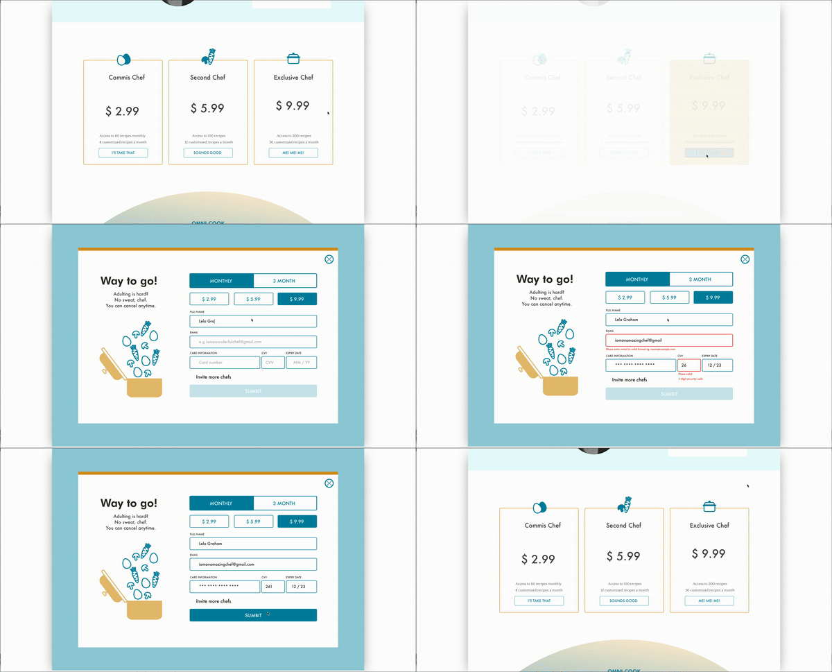
Final Deliverables | Choose Plan and Checkout
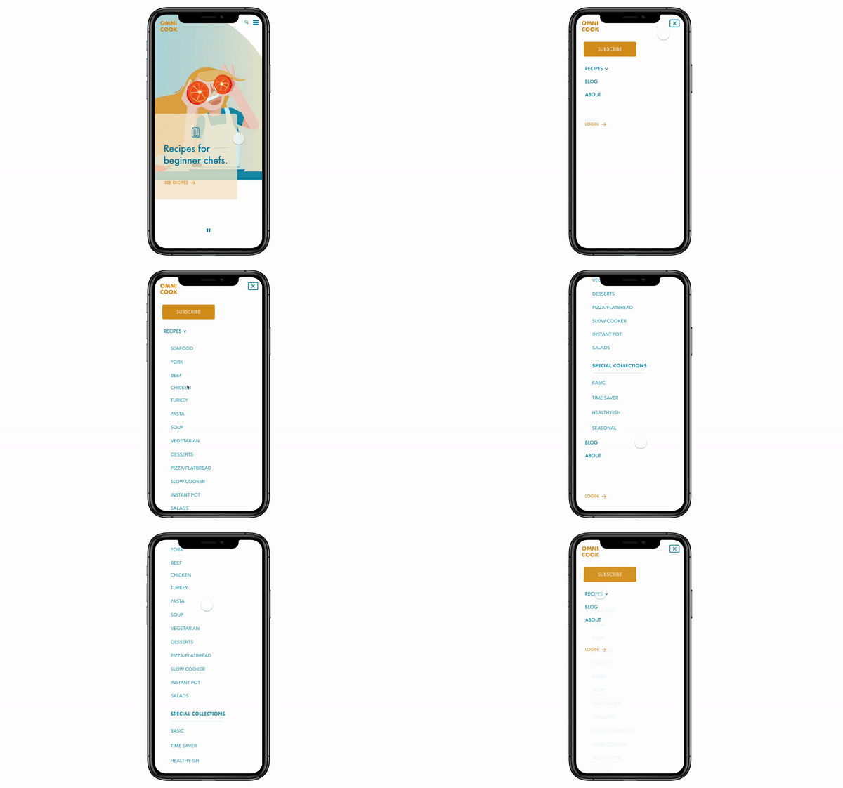
Final Deliverables | Landing Page for Phone
Final Deliverables | Filter for Phone
Final Deliverables | Browsing Plans on Phone
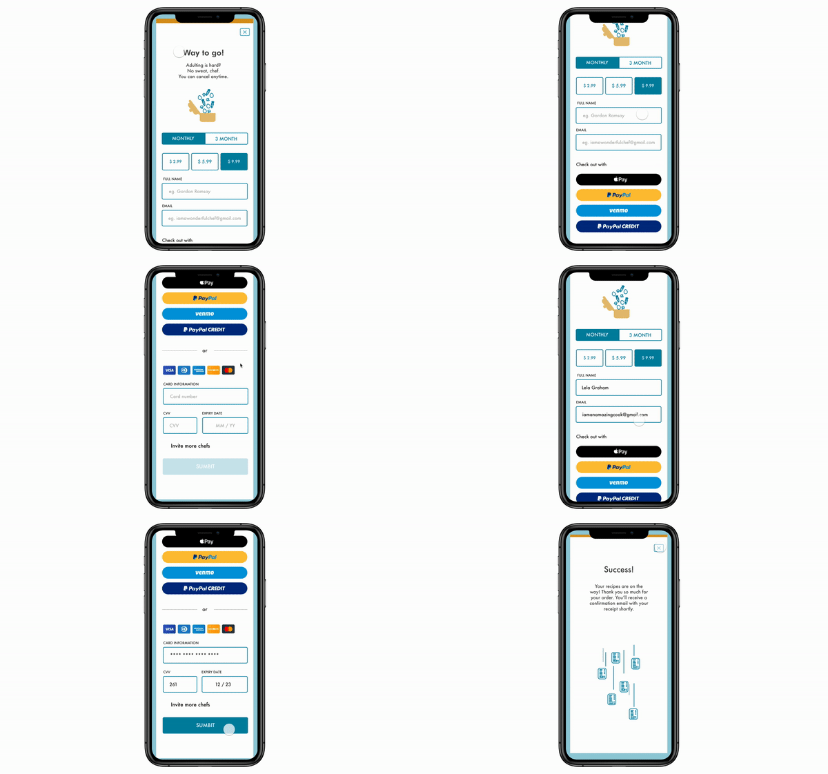
Final Deliverables | Checkout
Research
My friends and I love watching cooking videos online, but we rarely make the dishes ourselves. What is it so hard to make up our mind to cook? Why do we never remember we have saved cooking videos or recipes somewhere online? How might we make our cooking experience better?
Pain points
I talked to my newly grad friends and friends that have been in the workplace for over five years. Here are the pain points that they wish can be improved.
They wish there is a place that could gather and organized their recipes in categories.
A clean recipe website that is not crowded by ads.
A recipe website that matches their lifestyle and their cooking skills.
User Flow Before User Test
Website Sketches | I named the brand “GRO” at first. It means a growing professional chef. I abandoned the name later in the project.
WIreframe and prototype
I quickly sketched out what I thought could be necessary for a recipe website and made a wireframe and a prototype to test out my idea.
Wireframe | Landing Page
Wireframe | Recipe Page
Wireframe | Filter
Wireframe | Explore recipes
Wireframe | Sign In
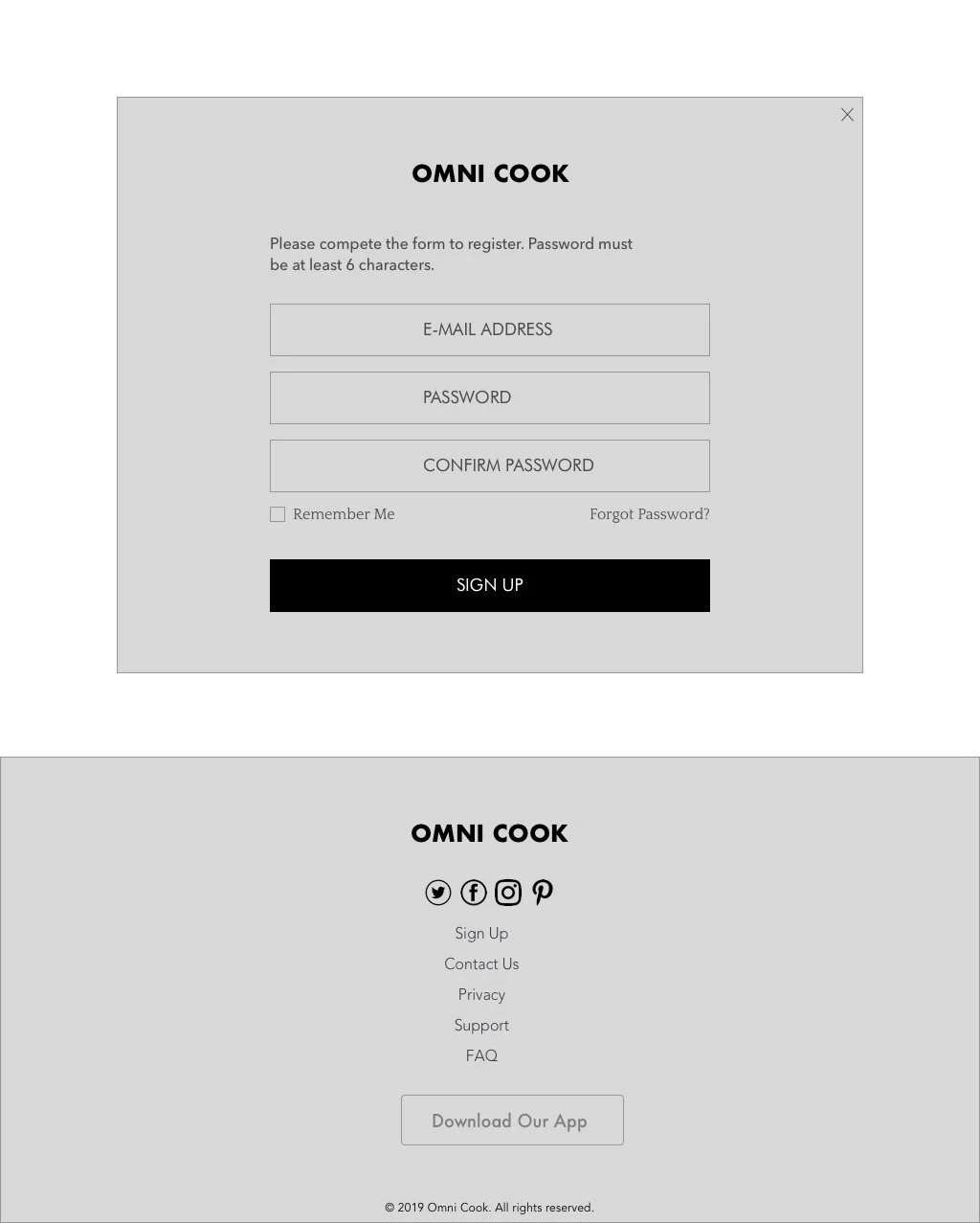
Wireframe | Sign Up
1st Prototype | Landing Page
1st Prototype | Recipe Page
1st Prototype | Explore Filtered Recipes
1st Prototype | Explore All Recipes
User test feedback
“It does not standout from other recipe websites.”
“I probably won’t scroll that far to get to the collections.”
Final Prototype
I have thought through the visual design entirely according to the feedback from the first prototype. Here are the changes I have made...
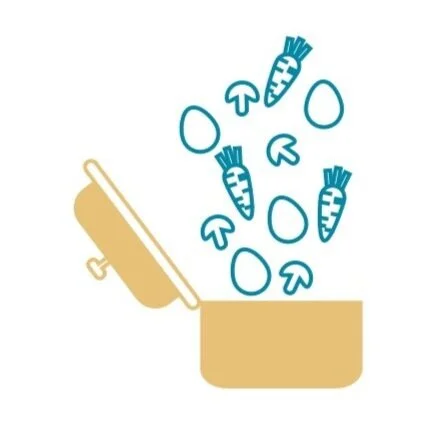
Adding customized illustration to help the brand stand out from competitors.
Showing users what the subscription options are up front on the landing page.
Pick a friendlier and more welcoming color palette.
Showing users the payment journey.
Final User Flow
Hero Image | Sketch
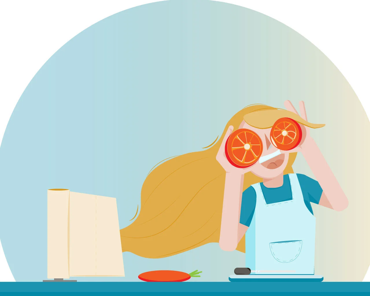
Hero Image | Final Illustration
Secondary Image | Sketch
Secondary Image | Final Illustration
Visual Elements | Category Icons
Visual Elements | Option Icons
Visual Elements | Success page
Visual Elements | Checkout Page
Challenges and future versions
The biggest challenge was adding customized illustrations after the first prototype. It was a bold move for this fast-paced project since I was almost ready to continue on my high fidelity prototype. But I am glad that I made the change. It really helps the website stand out.
There are many iterations I want to include in the future versions, such as…
How the users share recipes they like with friends.
The ability to save recipes to a joint collection with partner, friends, or family.
What the actual recipe page look like with videos and shopping lists.
The ability to review and comment on the recipe.
How machine learning help generates customized recipes for individuals.
